While the first three months of 2023 have had significantly more housing demand than we expected coming out of the ice-cold fourth quarter, the real story of the year continues to be restricted supply of homes to meet that demand.
The question for the rest of the year is whether that demand holds up, or if the economy turns and uncertainty takes over like it did last fall. We haven’t seen any turn in the data yet, but we keep watching for it.
Every week, Altos Research tracks every home for sale in the country. We analyze all the pricing, supply and demand, and changes in that data, and we make it available to you before you see it in the traditional channels.
Inventory doesn’t change week to week
There are 413,000 single-family homes on the market this week across the US. That’s basically unchanged from last week — actually a tiny fraction fewer. Inventory is still unchanged for three weeks in a row now. The lowest point was officially two weeks ago.
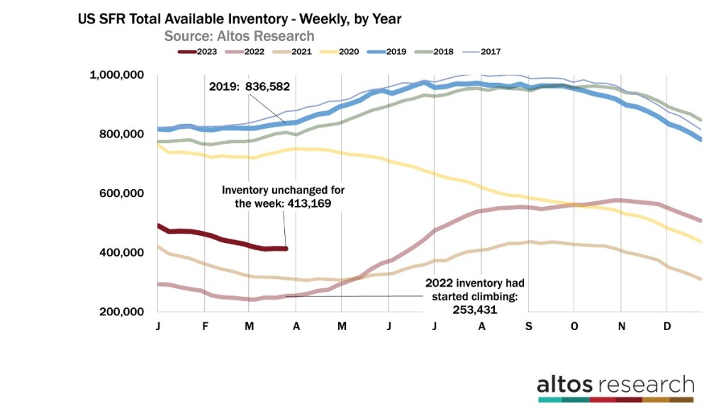
In the chart above, we’re showing the inventory curve for each year. Each line here is a year. The pandemic years’ inventory are the lines at the bottom. That was both low supply and ravenous demand contributing to that scenario. You can see how last year inventory started rapidly increasing in the second quarter as mortgage rates rose. That’s the light red line. Later in 2022, inventory has a second burst of listings in the fall which was very unusual, and was a reflection of how dramatically home buyer demand slowed at that time.
This year, Q1 has seen significantly more demand that we expected. Inventory has fallen from the slow fall. The question for the rest of the year is how quickly the dark red line climbs. Does demand weaken again like last year? That’s going to be a question of the economy. Do we have big job losses coming? Do we have banking crises or other shocks coming? Even the uncertainty itself is a risk to derail housing demand from here. If demand weakens from here, this year’s inventory curve will slope up steeply like last year’s.
If this year’s curve is like most of the years on this chart, then we’ll end the year with closer to 500,000 homes on the market again, staying in this pattern of incredibly restricted supply.
If the economy tanks hard, then the curve could pick up quickly like last year. But there’s no indication anywhere in the data yet that any surge of inventory is imminent. There is no AirBnB bust or other investors that are unloading homes. Homeowners in America are not interested in selling — yet.
The Y Axis is not zero scaled here so we can illustrate the weekly change in inventory rather than the absolute distance from none. The blue line is for 2019 before the pandemic when we had 836,000 single family homes on the market at the end of March that’s twice what is currently available. Plus in 2019, inventory had been climbing for seven weeks already by this point.
And when we look at the volume of new listings each week, you can see how dramatic this shortage is. Since July 4 last year we just have very few people selling homes. There’s no sign of that changing yet anywhere in the data. This week only 68,000 new listings hit the market. About 16,000 of those went into contract immediately.
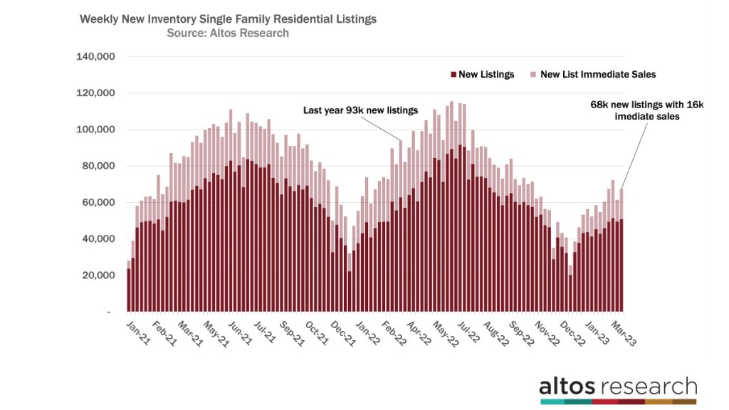
The chart above shows us supply and demand. Each bar is the new supply each week. Every week now has about 25% fewer sellers than last year. Supply is very tight. The light portion of the each bar are the immediate sales each week. And you can think about that as a gauge of demand. These are homes that got listed and purchased right away. The immediate sales are much smaller that last year too. You can see demand is bigger than last Fall, but just no comparison to last spring when buyers were rushing to get their deals done as rates were on the rise.
Two things to watch
Two things to look out for here — if you’re on the lookout for a weakening housing market, you’ll want to watch supply and demand. Last fall, showed us demand can grind to a halt even when we have very little new supply. But also if we get to a point in the economy where people, especially investors, are unloading their properties, then we should see supply finally climbing.
The bars each week would be getting taller. And investors own a ton of properties across the U.S., so those could indeed add to inventory later in the year maybe 2024. We’ve been watching for that to happen for 24 months now, and it hasn’t happened yet. But it could, so look for that change in this chart.
Spring home prices tick up
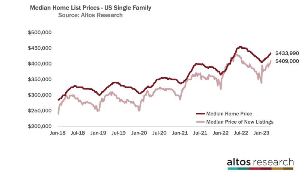
Meanwhile, spring home prices are ticking up slowly each week. The median price of all the homes on the market in the U.S. right now is $433,000. If you walk into the market today, this is what you’ll see. It’s actually a little higher than last year.
The price of the new listings this week is $409,000, and that’s flat from last year at this time. The price of the new listings reflects that sellers and listing agents know exactly where demand is in their local markets and they price in aggregate at the selling price point. The price of the new listings ticked up 2% this week.
Last year, you can see the light red line was sprinting higher each week at the tail end of the pandemic boom. So the year over year comparisons will continue to look unfavorable. The headlines will report negative year over year home price change for the next several months.
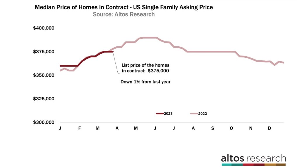
If you’re looking to tie the pricing leading indicators most directly to the sales prices you hear in the headlines, it’s useful to look at the pendings. These are the homes that are in contract that’ll close in the next month or two. The median price of the pendings is $375,000 which is 1% lower than last year at this time.
This will widen in the next few months too. You can see how the pendings price last year, the light red line, kept climbing pretty steeply until May. So even though home prices aren’t falling right now, the year over year difference will continue to widen. The headlines will exaggerate the decline from last year because the final sales prices last year included a lot of overbidding. That overbidding is largely gone now.
We’ve been talking for 9 or 10 months about how home prices for 2023 would be flat or down and that moment is now upon us. So like we saw today’s state last year, now it looks like another big economic shock like recession and job losses will have to hit before home prices take another step down.
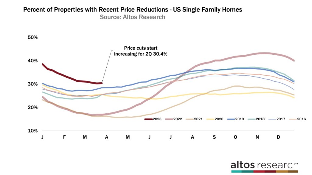
As I’ve mentioned we’re in this moment like we were at the beginning of last year when you expect the market to slow, but it hasn’t yet. Last year we kept looking for rising inventory and rising price reductions both of which hit record lows during the pandemic.
This year price reductions are not at record lows. But they’re just on the high side of normal. Just over 30% of the homes on the market have taken a price cut as of this week — see the dark red line here.
Now, if a recession, crisis or job losses start hitting housing demand, we’ll see sellers have to cut their prices like we saw last spring. A year ago in March, we could just start to see the market cool compared to 2021. That cooling really accelerated starting in April. See the light red line lift off the bottom. As of right now this year, the trend is opposite that. Price reductions are not yet accelerating because supply is tight and demand is surprisingly resilient.
So again, we’re trying to be highly sensitive to market conditions changing. Will home prices turn south again? And we’ll see it here very quickly like we did in March and April last year when that finally happens.


